Chapter: Worker Safety at WSIB Lab

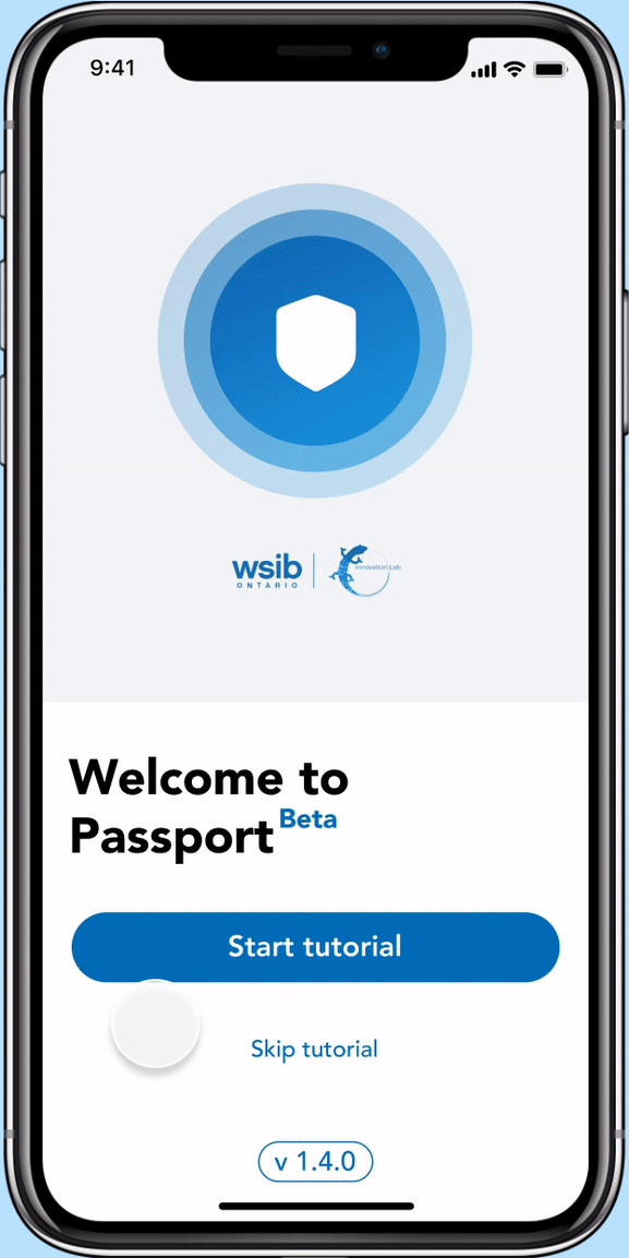
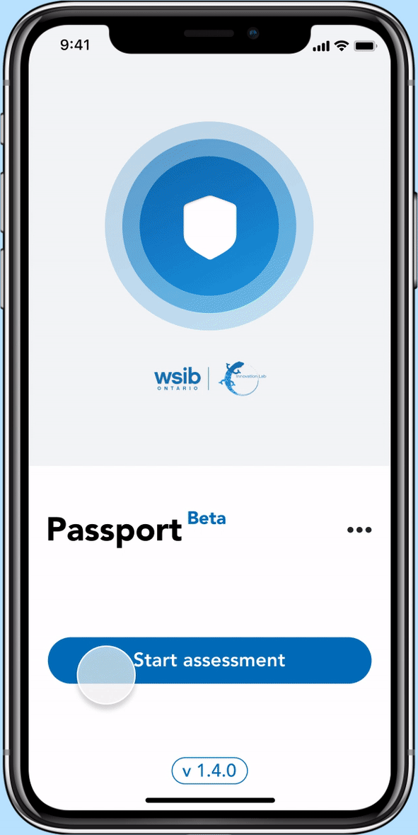
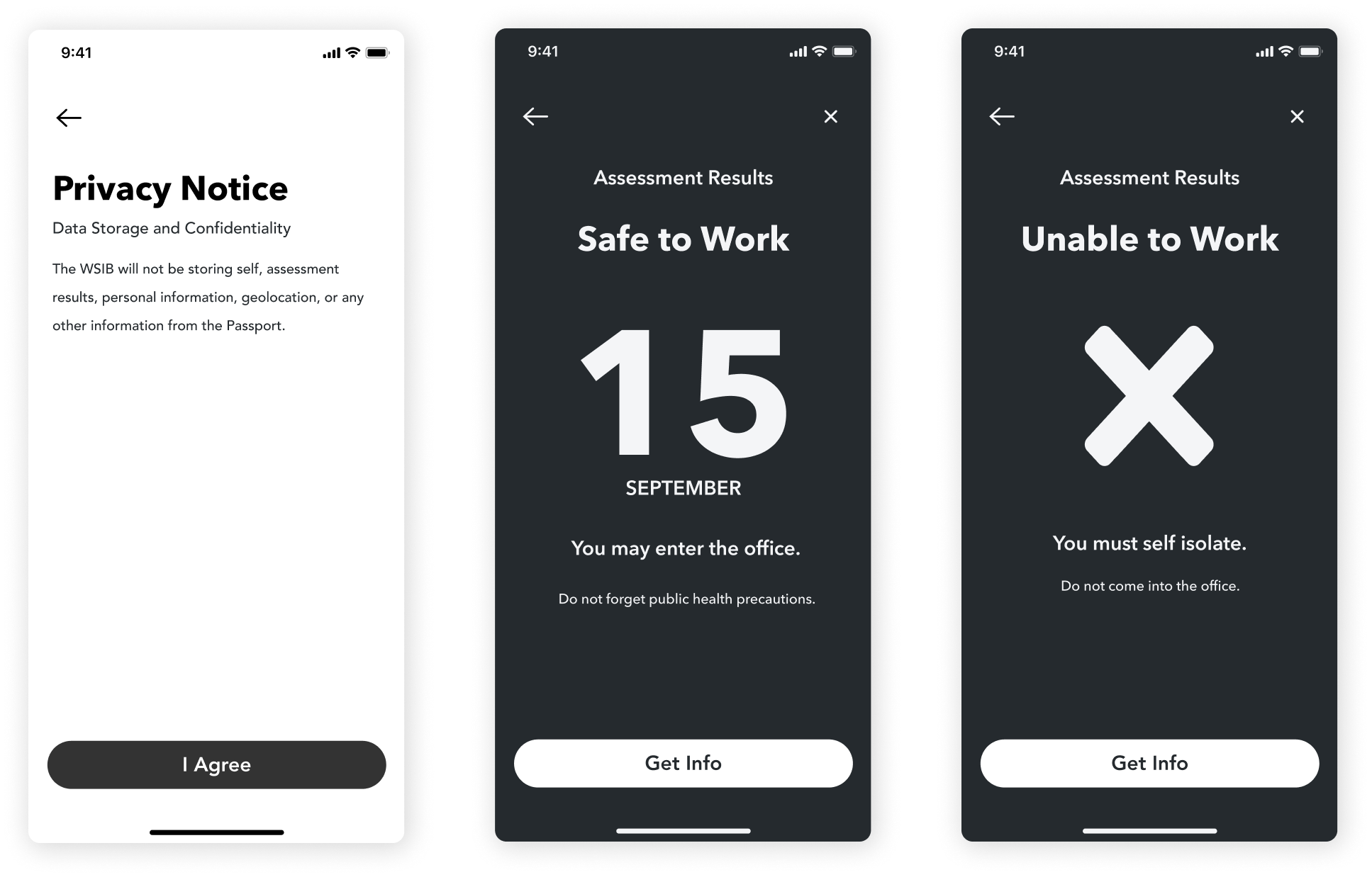
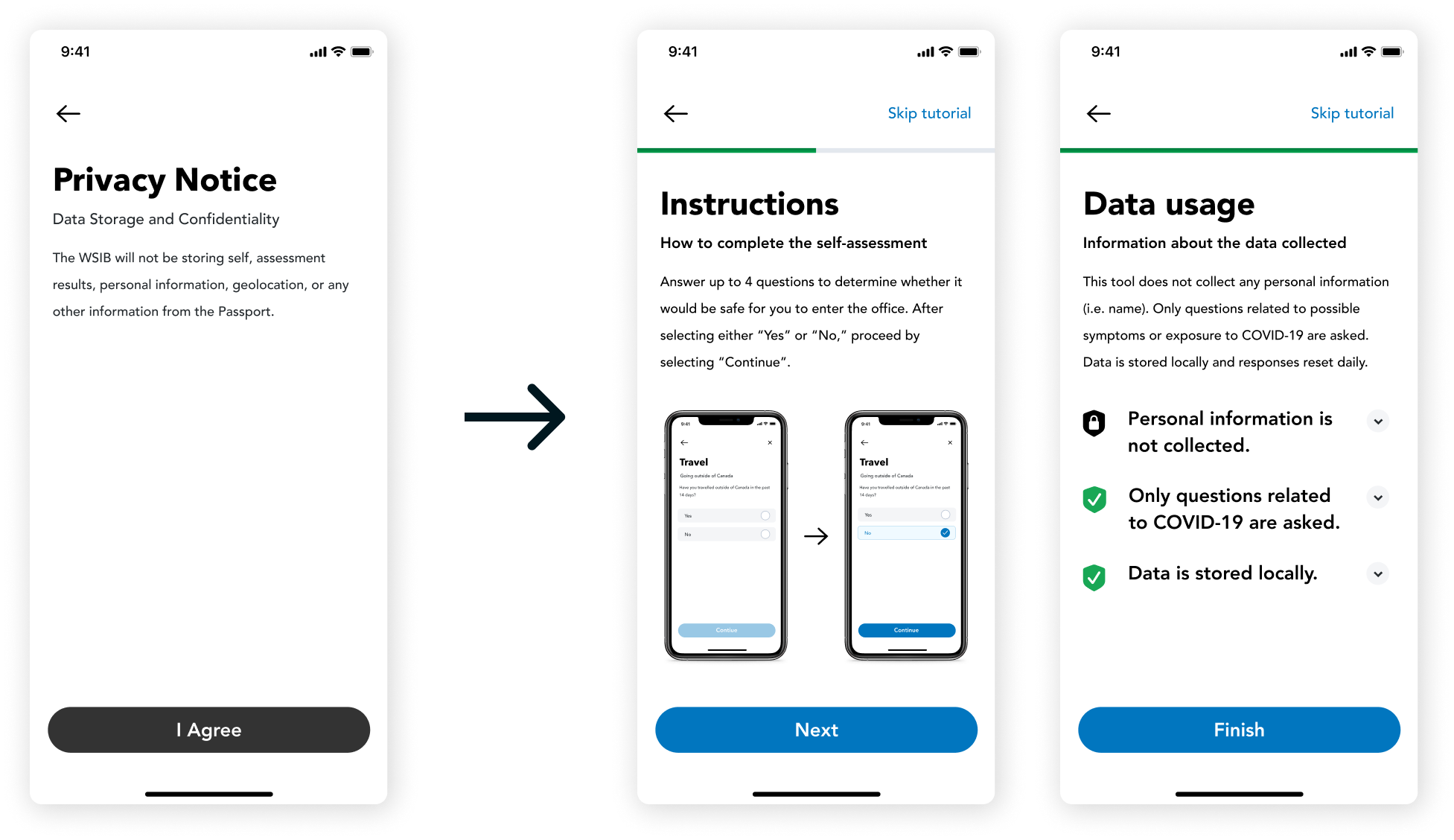
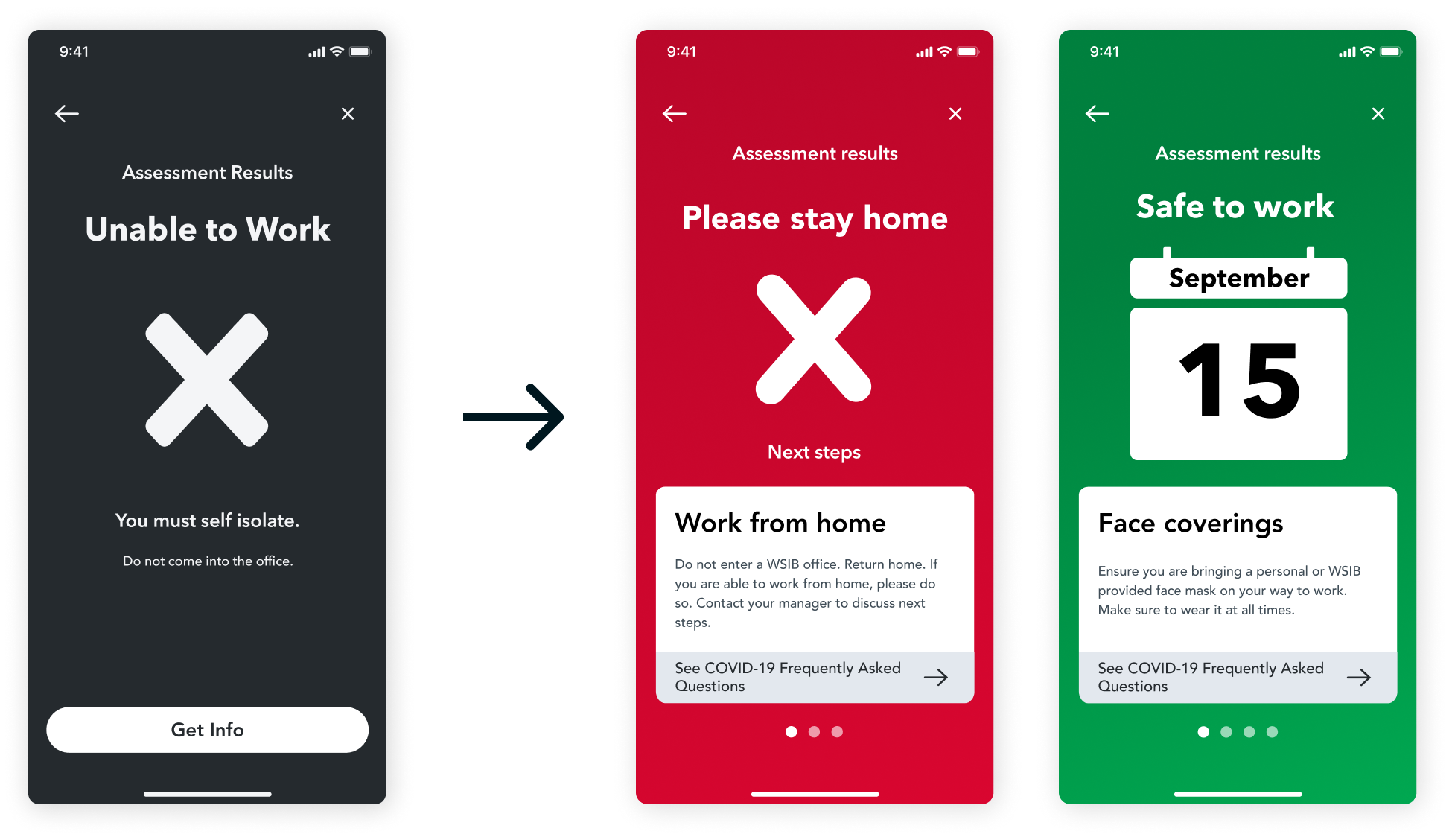
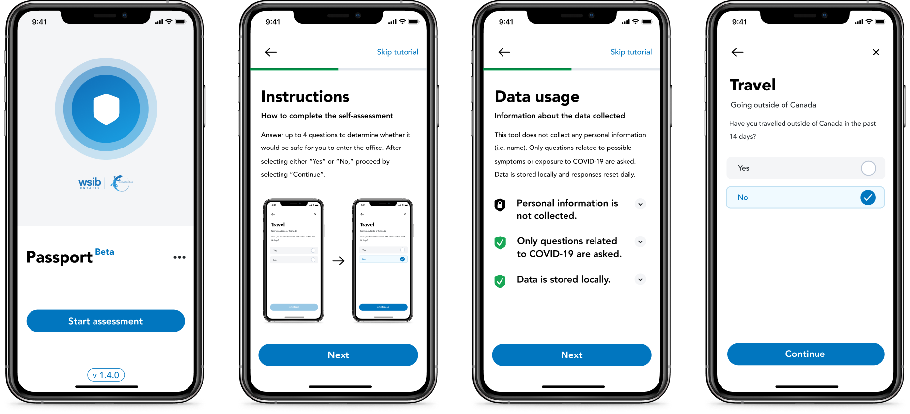
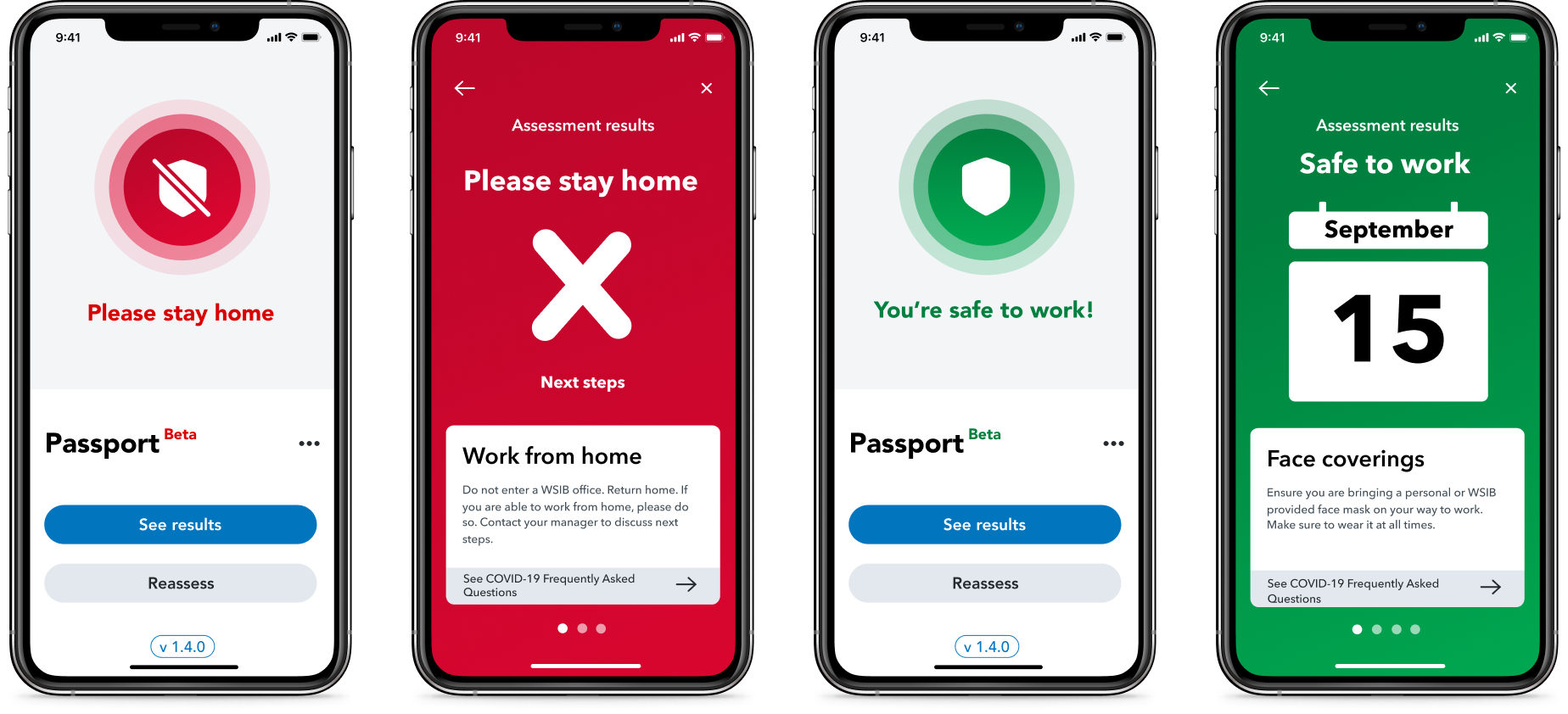
Project Overview: Passport is a mobile application that allows WSIB staff to complete a COVID-19 self-assessment in order to safely return to offices.

Role: UX/UI Designer

Team: Myself, Kouthar Waled (UX/UI Designer), 1 Design Lead and 4 Developers

Tools: Figma, Maze, Jira

Timeline: September 2020 - October 2020

Areas of Design: User Research, Visual/Interaction Design, Developer Collaboration
Imagine starting your first product design internship and being thrown right into the deep end of designing a product from scratch. This pretty much sums up my experience designing the Passport app as a UX/UI designer at the WSIB Innovation Lab. Allow me to tell the story of how this has shaped my skills as a designer…

PROBLEM SOLVING

Problem Statement
WSIB’s plans for return to office during the COVID-19 pandemic had been anticipated for some time. To follow public health protocols and ensure a safer work space for staff who do return to office, staff must complete a self-assessment to test whether they are able to enter the office space and then verify this with building security from 6 feet away. Currently, the solution is to fill out a paper survey - our job was to take this process and translate it into a more efficient digital solution.
User Research
Our users consisted of the corporate WSIB staff who were going to return to offices. The WSIB staff includes users who range from young, tech-savvy individuals to senior staff that have worked at the organization for decades.
WSIB Staff
We conducted initial user research through the form of interviews. The goal of this user research was to validate our initial assumptions about the user base, especially in terms of privacy.
We asked users questions around:

a. Their understanding of the COVID-19 pandemic

b. Their views on data usage and communication
Critical Thinking During Interviews
Whenever I approach a problem, I always think critically and ask many questions before I start ideating and creating solutions.
For example, when asking about whether users would be comfortable attaching their identity to the answers of the self-assessment survey, I added follow-up questions to understand to what extent users would be willing to share their information. From this, we got the insight that, although users say they are comfortable sharing their personal information related to the survey to the WSIB, some were not actually willing to attach their name to their responses.

I also made the point of adding questions related to the users’ current opinion on the COVID Alert App that was recently released by the government of Canada as a form of contact tracing. From these questions, we got the insight that users did not trust the effectiveness of the COVID Alert App due to the voluntary nature of the data shared on the app and its overall low usage rate across the country.
User Pain Points
The interviews brought us to three key pain points that users were experiencing:
Lack of trust with the current situation
Dishonesty in answers as users are self-assessing
Verifying self-assessment results safely

DESIGNING A SOLUTION

Addressing Pain Points in Mid Fidelity
To aid with the first issue of lack of trust, we decided to include extra communication in the application around the usage of the data through a privacy notice. By communicating this effectively to users, the idea was to foster trust by indicating that the WSIB trusts its staff to answer honestly without extra verification of identity.
To tackle the second pain point, we designed the results screen for a successful self-assessment to show the date that the result was received. This extra indication of the date would help mitigate the risk of users screenshotting previous success results screens and makes sure that they are completing the self-assessment on the day of actually entering the office.
For the last pain point, we designed the results screens to clearly show whether the person has passed or failed the assessment through the form of visual icons like an ‘X’ or a check mark. We also planned for the background colours to be green for success and red for failure, but included the icons to account for users who are colour blind.
Sharing Out Designs for Feedback
As a designer, I never work in a silo. My approach to making sure I am appreciating a variety of perspectives on the solution and catching any blind spots I missed is to share my work with the team and our users. After receiving some feedback, we iterated on the designs from our mid fidelity stage.
First, we realized that users would likely not read the privacy notice as they are in a rush to get to work in the morning. To help the user learn how to use Passport and actually understand the data usage, it was more effective to build out an onboarding tutorial that breaks down the communications of the application into step-by-step pages that are explained with visual aid.
Next, there were also challenges to designing the results screen. These screens had a dual goal - one was to help with security verification and the second was to provide the user with some next steps or help. We were cautious of overloading one screen with too much information that could overwhelm a user - especially those who were less tech-savvy. We went through many iterations of how to incorporate the date, icons and informative “Next Steps” cards on the screen.
Final High Fidelity Designs
We tried to make each screen as simple as possible - with main actions on the screen and secondary actions hidden in a menu. Everything was designed with accessibility in mind to meet AAA contrast standards following our custom design system patterns.
User Testing With Maze
We used Maze to run user tests by presenting them with user flows to complete in the form of “missions”. From this, we received very positive feedback on the usability of the app. Here are some summary metrics that our Maze revealed:

LEARNINGS FROM THIS PROJECT

Adapting to New Circumstances
Passport was the first mobile app that the WSIB developed that has potential for large-scale usage within the company to facilitate safe return to work procedures. Initially, when we took on the project, we had to move very fast because we only had 2 months to go from nothing to a fully developed app.
I learned how to collaborate quickly with a new and remote team of individuals who I’ve never met before.
We also focused on communication as a team. For example, I voiced concerns to introduce some more structure into our design/development handoff processes, so we were able to create a more seamless process for bug fixes and feature development afterwards. We also leveraged the existing capabilities of our tools to integrate Figma with Jira.
How I Grew as a Designer
I learned a lot about making design decisions - essentially weighing design trade-offs.
Especially with the mobile format, viewing from 6 feet away, accessibility and goals of each screen, it was challenging to understand prioritization and how to make the app easy to navigate for the user.
Furthermore, I learned about organizing information in a consumable manner so users would not be overwhelmed.
For example, using cards, using various spacing techniques, placing visual emphasis in some places, breaking down content, etc. are all methods that were used to help condense the information presented on the tool.
Next Steps
The next step is gather more quantitative and qualitative feedback on whether the app is successful in enabling WSIB staff to return to offices safely. Currently, Passport has been launched to a skeleton crew of 100 workers and the feedback we received was that the app was easy to use and the onboarding tutorial, with the emphasis on data usage, was highly appreciated.

Next Chapter: Social Good With UW Blueprint