Chapter: Social Good With UW Blueprint

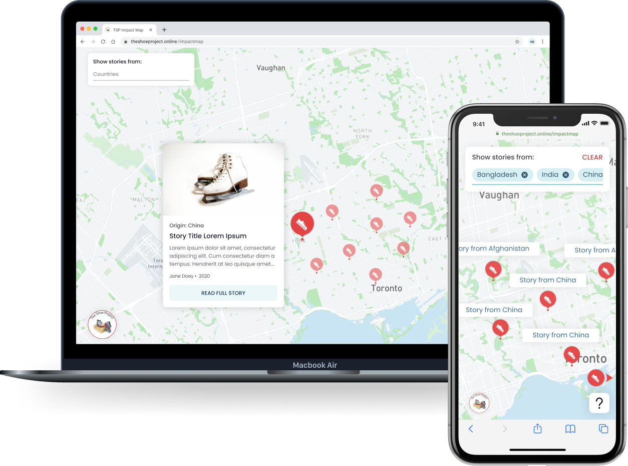
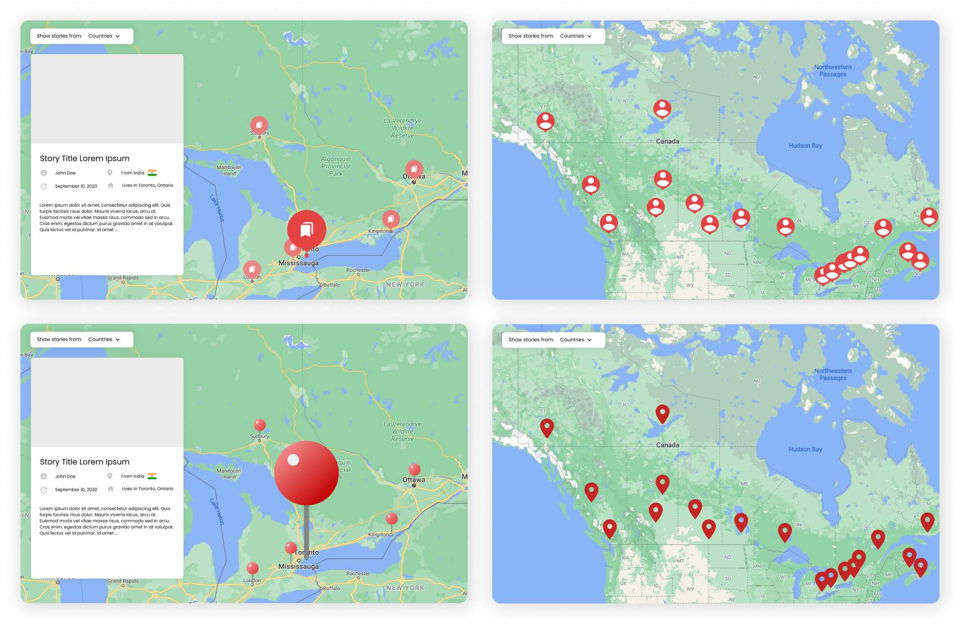
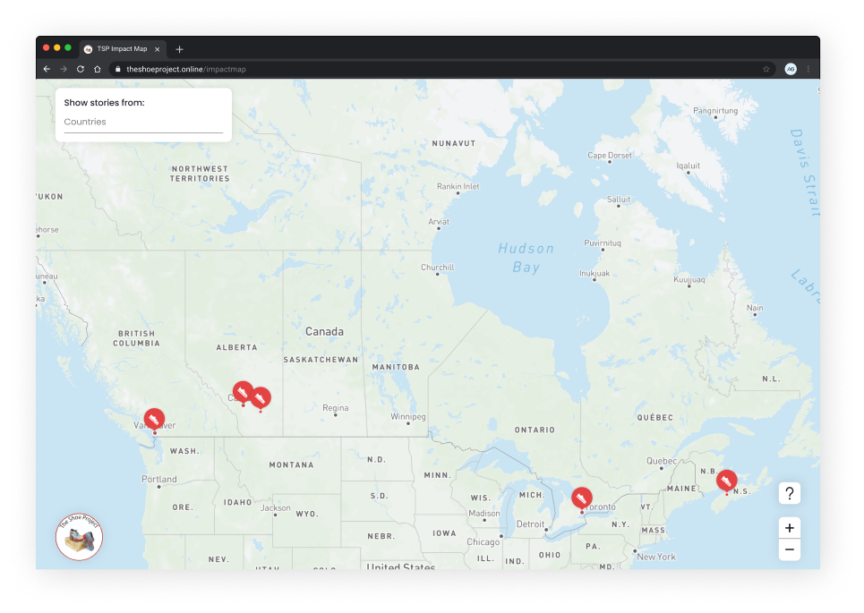
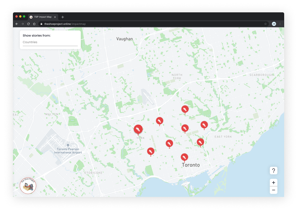
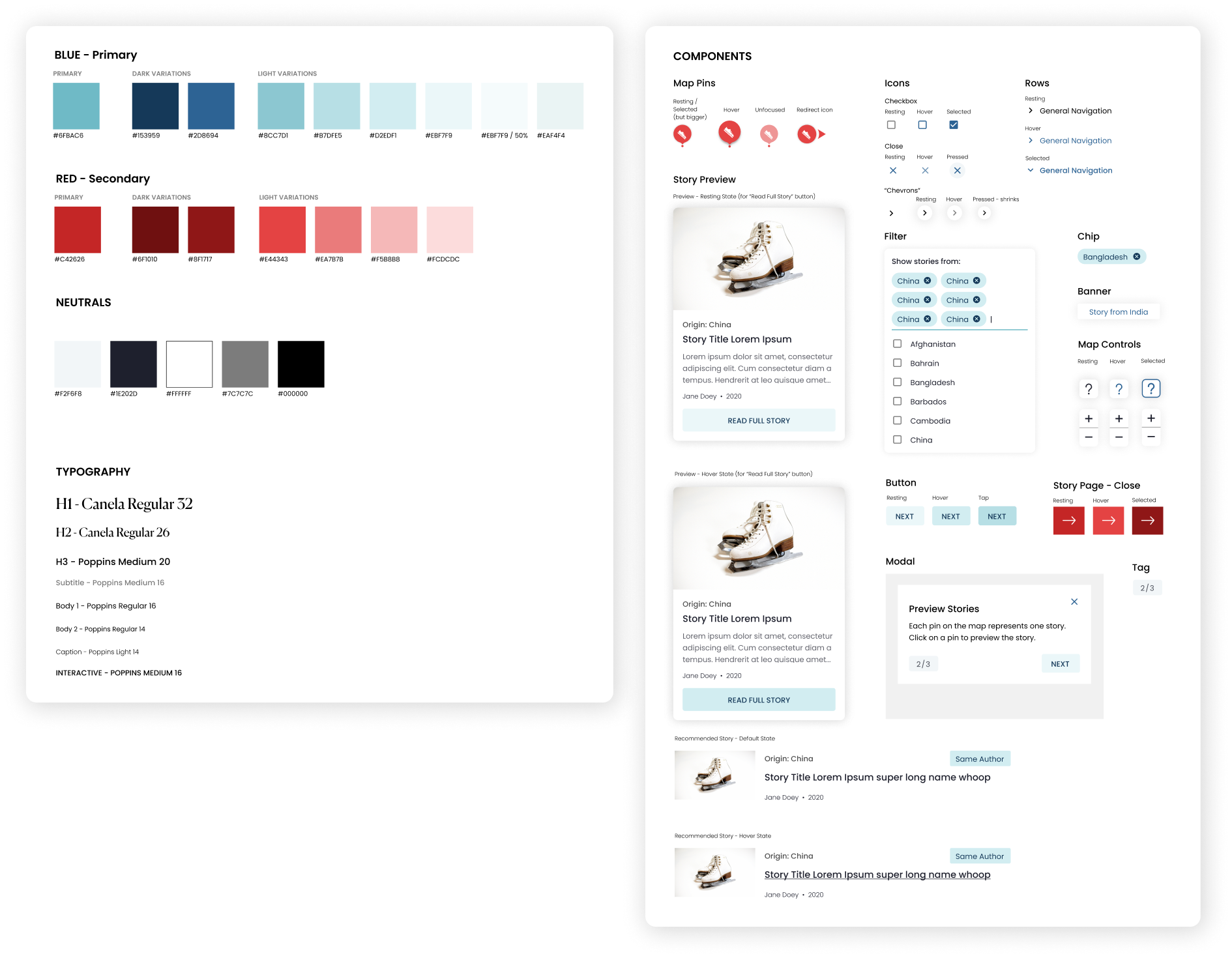
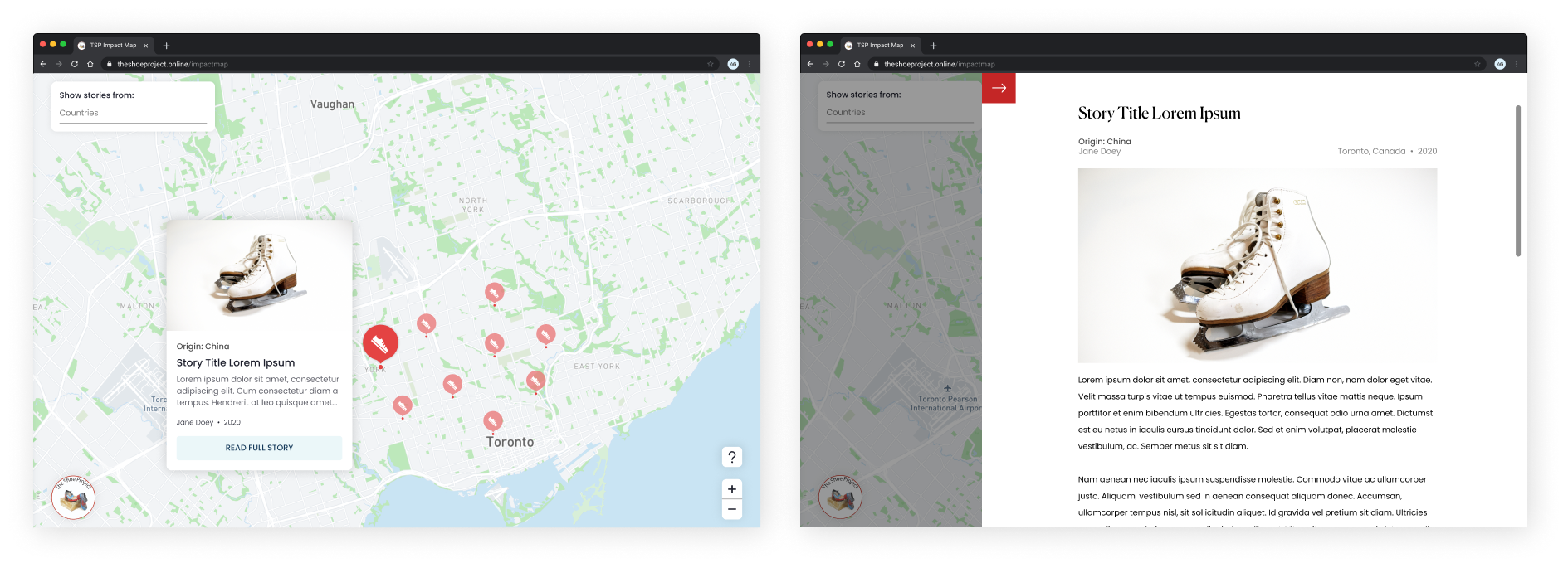
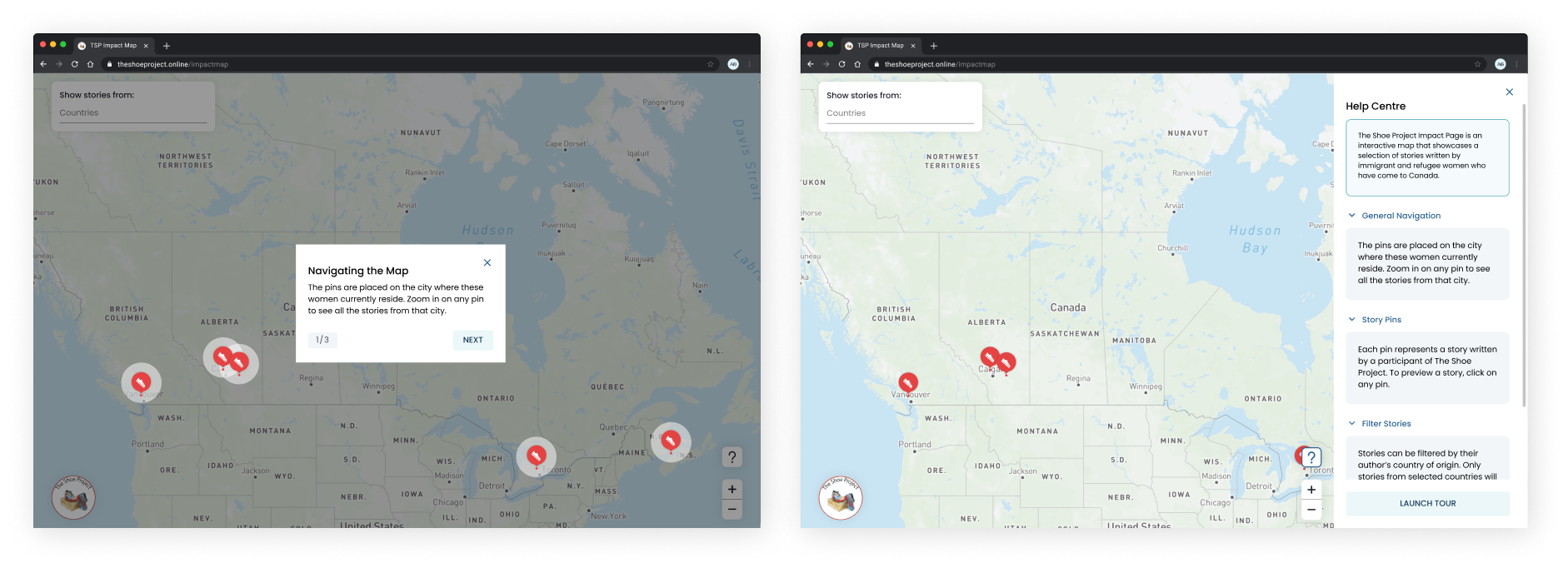
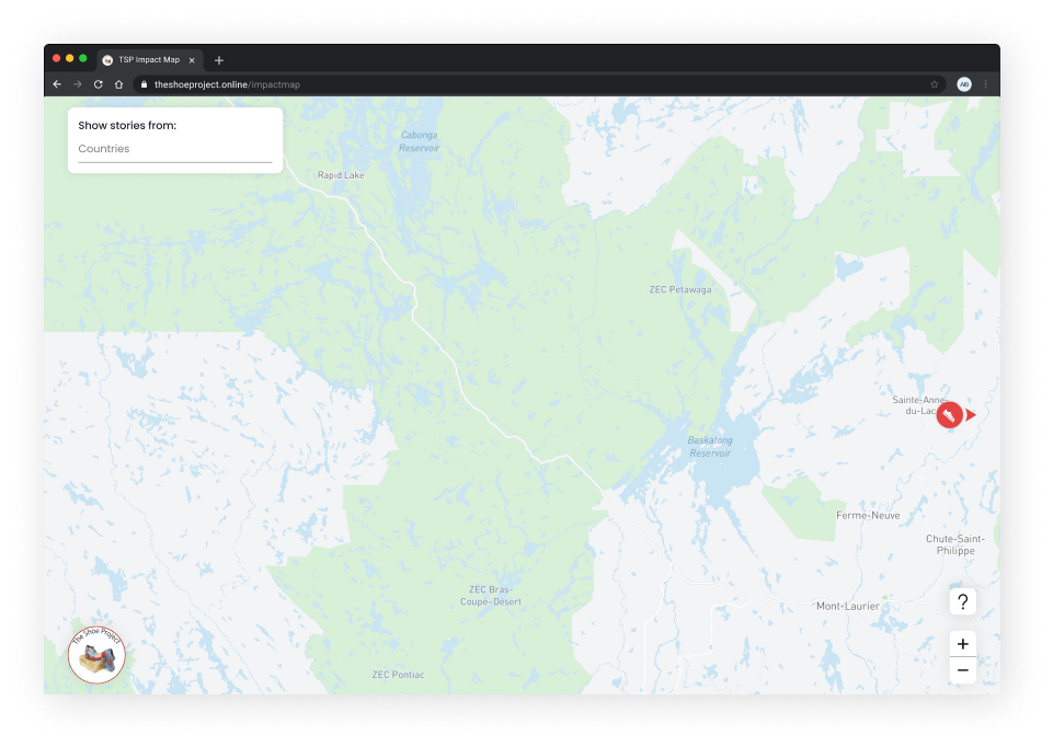
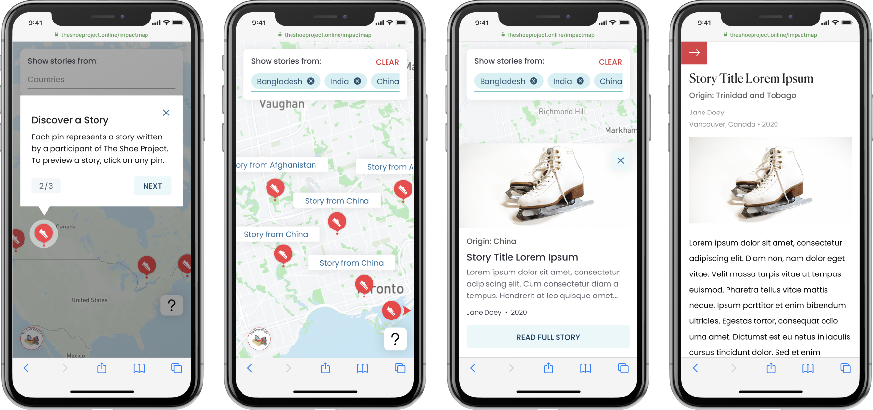
Project Overview: We partnered with The Shoe Project to create an interactive map to showcase 33 stories of immigrant and refugee women’s journeys to Canada.

Role: Product Designer

Team: Myself, Joslyn Tsui (Product Designer), 1 Product Manager, 1 Project Lead and 7 Developers

Tools: Figma

Timeline: September 2020 - December 2020

Areas of Design: Client Work, Visual/Interaction Design, Developer Collaboration
In many faraway lands, courageous immigrant and refugee women battled the circumstances to create new lives for themselves in Canada. To celebrate The Shoe Project’s 10th anniversary, UW Blueprint has partnered with them to develop a map to showcase these stories to the world. Here’s how I have been able to use my skills in design to help them create this impact…
Check out this Medium Article to read about the outcome of this project. Also, feel free to browse our launched Interactive Map to see the product in action and read the stories written by the women!

DESIGNING FOR A USER

Explorations
This project was one where we primarily communicated with the client and built our designs off client requirements. However, as Product Designers, we always kept the end-user in mind when creating the experience we wanted the users to have. Our design team took inspiration from various platforms that had mapping services such as Google Maps, Airbnb and Lonely Planet to guide our work.

Starting with low fidelity explorations, we worked together to compare which designs would yield the most intuitive experience for our users.
From talking with the client, we knew that we were designing for a wide range of users; this included business people, other immigrant/refugee women and even students conducting school projects. We kept this focus in mind.

One example of how we explored a wide range of different designs for the map was with the pin icons for the stories that were located at the women’s current cities of residence. Using the idea of the shoe as a metaphor for the women’s journeys to Canada, we decided to incorporate this idea in our final pin designs.

Here are the explorations for the pins.

Here is the final pin design that we decided on.
Design System
To create scalability across the designs, a design system was created so we could facilitate the handoff process with developers and ensure efficiency when making changes to our colours, typography and components. We leveraged Material Design guidelines as a pattern for our system.
Showcasing Stories
For ease of exploration across the map, we had the story pins open up to a story preview that included a synopsis of the story. This allowed the user to browse many stories across the whole map, whether they wanted to focus on one city or multiple. Then, we included a CTA that opened up the full story page. Since The Shoe Project’s goal was to get users to read as many stories as possible, this approach allowed the user to quickly get an overview of a story, similar to how a synopsis sells the story in a book. The full story pages also included a “Similar Stories” portion for further ease of exploration.
An Interactive Tutorial
Another focus of The Shoe Project was to allow the users to explore the map on their own. Thus, to facilitate the interactive process and simultaneously communicate what the goal of the impact map was, we included a tutorial at the beginning that used modals to highlight specific features of the map to the user. We made sure to also include a “Help Centre” on the side in case the user had any further questions about the map.
Designing for Edge Cases
We made sure to capture how we dealt with edge cases throughout the design process.

One example was if the user zoomed in too much and got “lost” as they could no longer navigate to a story pin on the map. Our solution to this was to include a redirect icon that appeared when the user was in a view that had no story pins. When the user clicked on this redirect icon, it would bring them to the nearest story pin on the map. As the pins were clustered around cities, the user would then be able to continue their exploration.
Mobile Designs
Our client’s Google Analytics report stated that they received most of their user traffic from mobile devices. Thus, it was imperative to ensure that there were mobile designs to facilitate users who accessed this map on their phones. We made sure to keep the best practices in mind when designing for mobile, such as ensuring that the touch target for icons were large enough and giving users the same level of flexibility as they would have with the desktop designs.

TEAMWORK

Working With the Client
While there are many forms of product design projects that I have taken on, this one is unique as it was primarily focused on working with a client. Alongside my team’s Senior Product Designer, Product Manager and Project Lead, I participated in weekly client meetings with our point of contact from The Shoe Project. In these sessions, we clarified the scope of the project, asked questions to iron out the details of our tasks and shared our designs with their team. These meetings were crucial for us to make sure we were always aligned with the client and carrying out the vision they wanted for the project.
Working With the Project Team
Collaboration with developers was key to ensuring the implementation of this project was successful. Here is how our team worked together:
• We leveraged our design system as the source of truth for front-end styling

• We included descriptions alongside our Figma designs to detail the interactions for the map

• Our work sessions included a weekly stand-up where we each shared what we were working on and showcased design updates as well

• We documented the changes we made to high fidelity designs and communicated them to the developers as soon as possible

• We made sure that we were always available to answer questions that came our way
As designers, we also appreciated the different perspectives and comments that the developers would bring up about the designs. This is what made our team culture so strong and helped us develop the project so smoothly.

LEARNINGS FROM THIS PROJECT

Lessons From a Senior Designer
This experience was a huge learning opportunity for me. I was able to gain so much knowledge from working with the Senior Product Designer, Joslyn, on my team. Joslyn taught me how to design for responsiveness, how to use grid layouts and also how to battle the gruelling intricacies of dealing with auto-layout.
She challenged me to think more creatively, to take inspiration from designs that were all around me and to continuously question how to make my designs better.
I am extremely lucky to have been able to grow so much as a designer from this experience, and I am excited to see where my journey in design takes me.
Working Remotely
A huge aspect of this project was the fact that we were all working remotely as a new team. I learned that the key to working well together remotely is to see how you can replicate an in-person experience through this new virtual format. From taking part in the multiple socials we had, I learned that bonding through inside jokes and sharing stories is the best way to get to know one another. I learned not to be afraid of sharing more and talking to my teammates to get to know them on a personal level.
It was also really important to communicate clearly and frequently, and not be afraid to ask questions when ambiguous situations came up.
As remote work becomes the new normal, I’m still learning to adapt to these circumstances, but I know I’m making a lot of progress!