Chapter: Finances With Bread

Project Overview: Bread is a financial application designed to help students track their daily spending and set budgeting goals.

Role:
UX/UI Designer

Team:
2 Designers

Tools:
Figma

Timeline:
February 2020 - March 2020

Areas of Design:
User Research, Visual/Interaction Design, Prototyping
In a world where there is an abundance of good food, advertisements tempting us to spend hours at the shopping mall and destinations drawing those with wanderlust in their eyes, it’s truly hard to save money. Keep reading to see how I tackled this issue through a collaborative passion project…

RESEARCHING THE PROBLEM

Problem Statement
Financial planning is important for anyone to make sure that they are managing their money in a smart manner. However, this important life skill is not taught in schools. Many students have had to learn financial planning on their own - and many are finding this to be a challenge.
This presents a long term issue where some students are not aware of how to properly budget and manage their money.
User Research
We interviewed several other students to gain an understanding of how they currently plan their finances. Here are the questions that were asked:
Is personal financial planning important to you?

How do you keep track of your spending?

What tools do you currently use to keep track of your budget?
The responses we got were pretty surprising. Many younger students actually indicated that they do not track their spending. They simply said that whenever they needed money, they would just ask their parents for it. Budgeting wasn’t an issue that they thought of that much, and they didn’t see a point in tracking their spending.
Insights from User Research
We realized that our target users don’t track their spending or budget properly because they don’t see the benefits of financial planning. This was the gap we had to target in our solution. Students also didn’t find tracking their finances to be convenient as many currently try to use tools like Excel for this. We felt that an app would be the best solution for convenience.

We also asked why users would go to Excel to track their spending. The answer we got gave us the idea to show graphs for spending habits, because individuals have indicated that Excel has a system for graph generation where people can see trends for their spending habits. That is also the benefit to financial planning that others currently don’t see.

EXPLORING A SOLUTION

First Attempt at a Solution
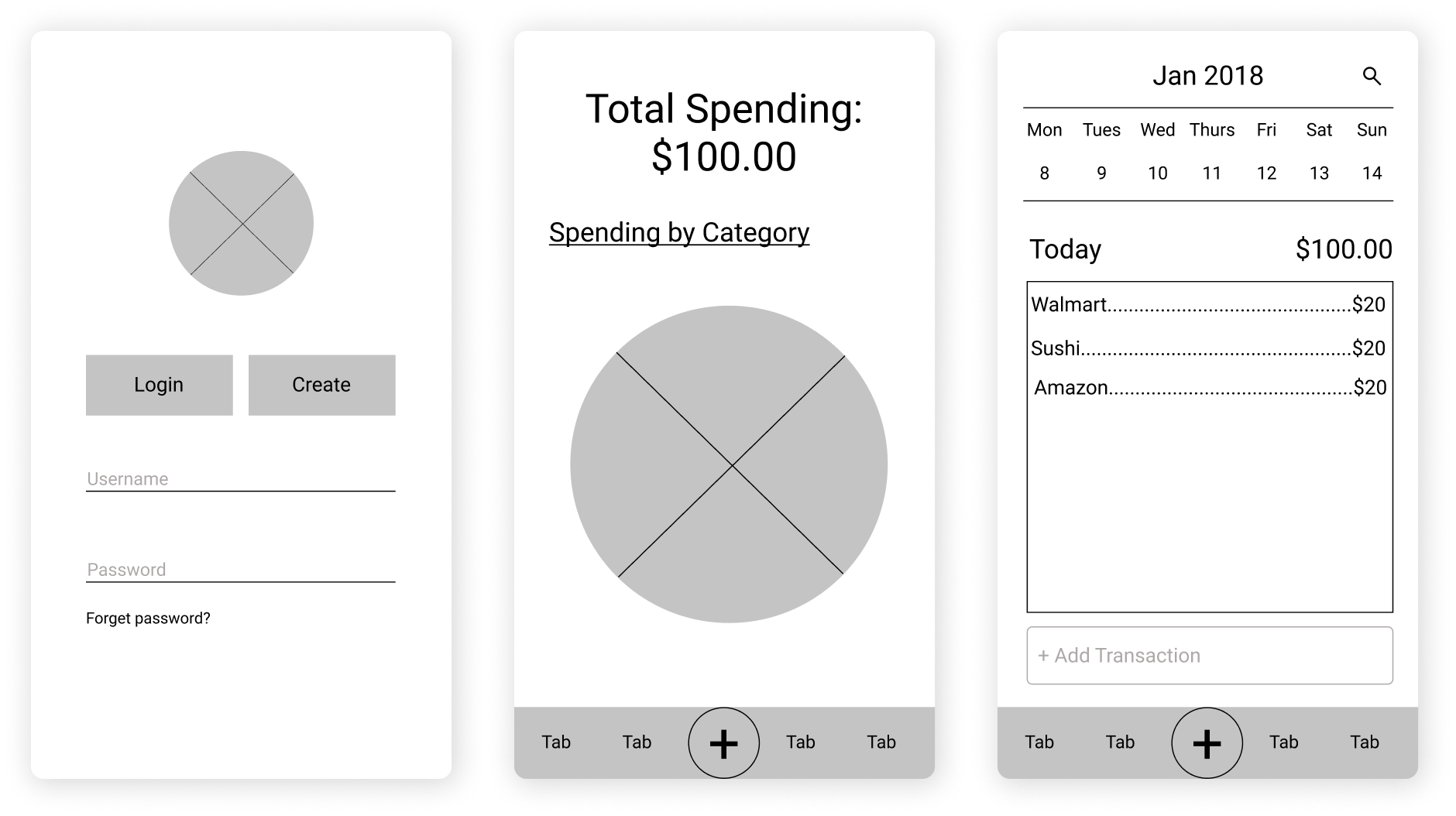
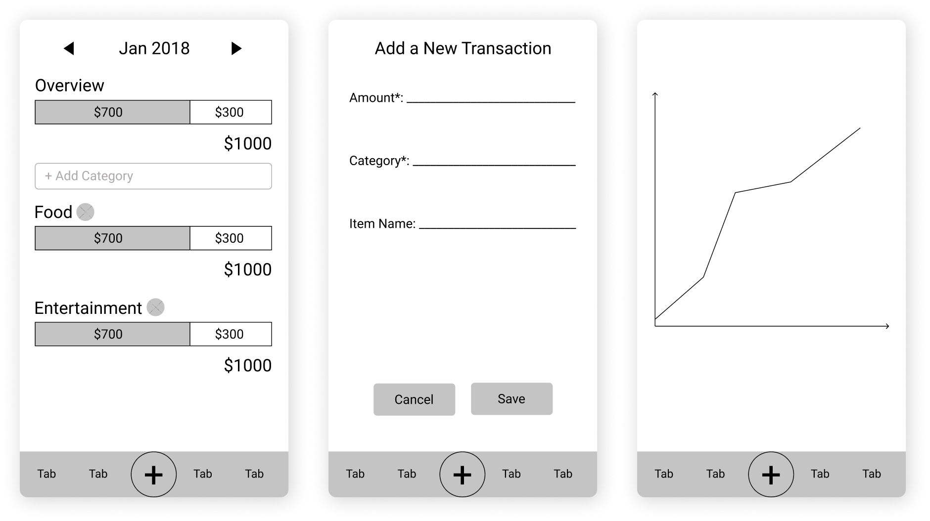
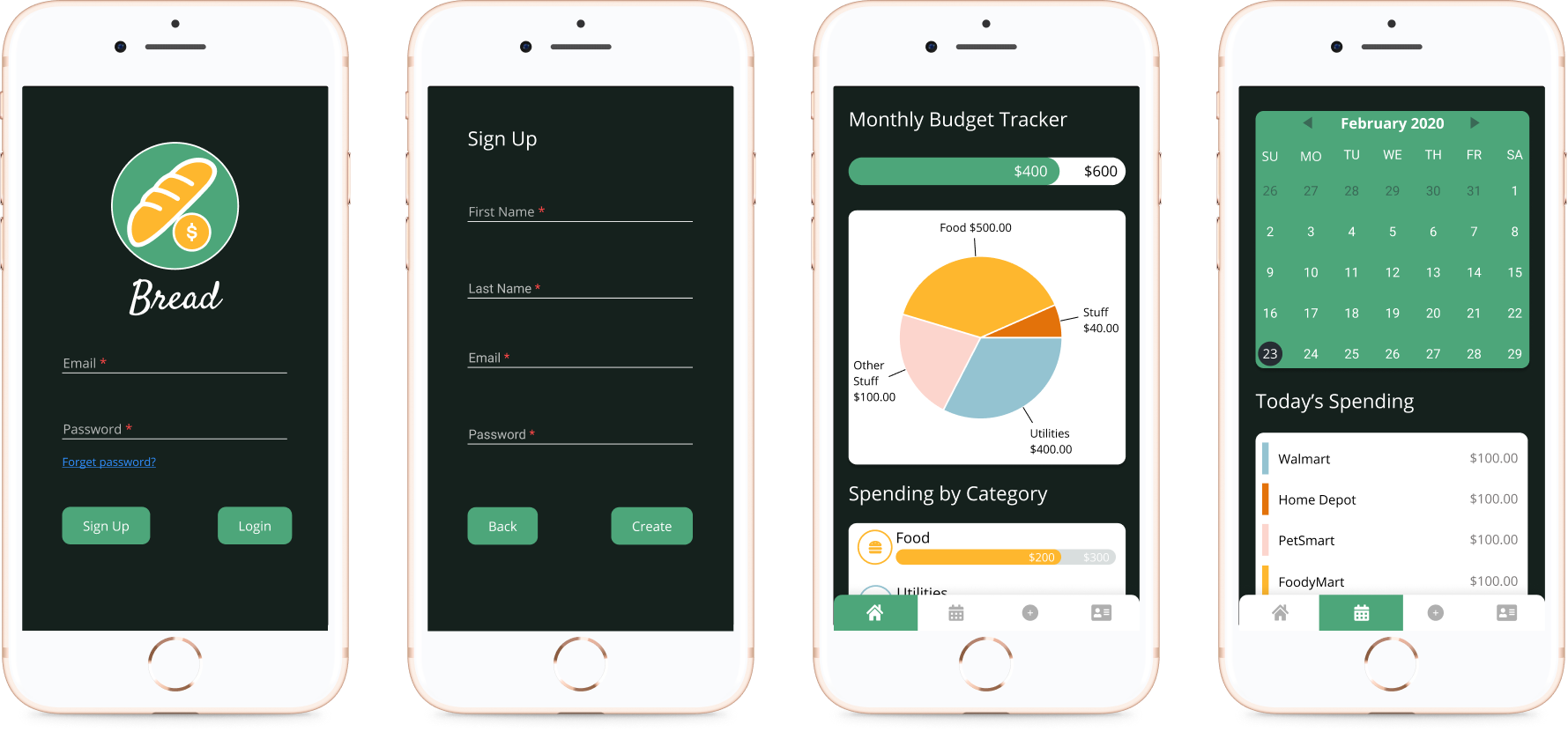
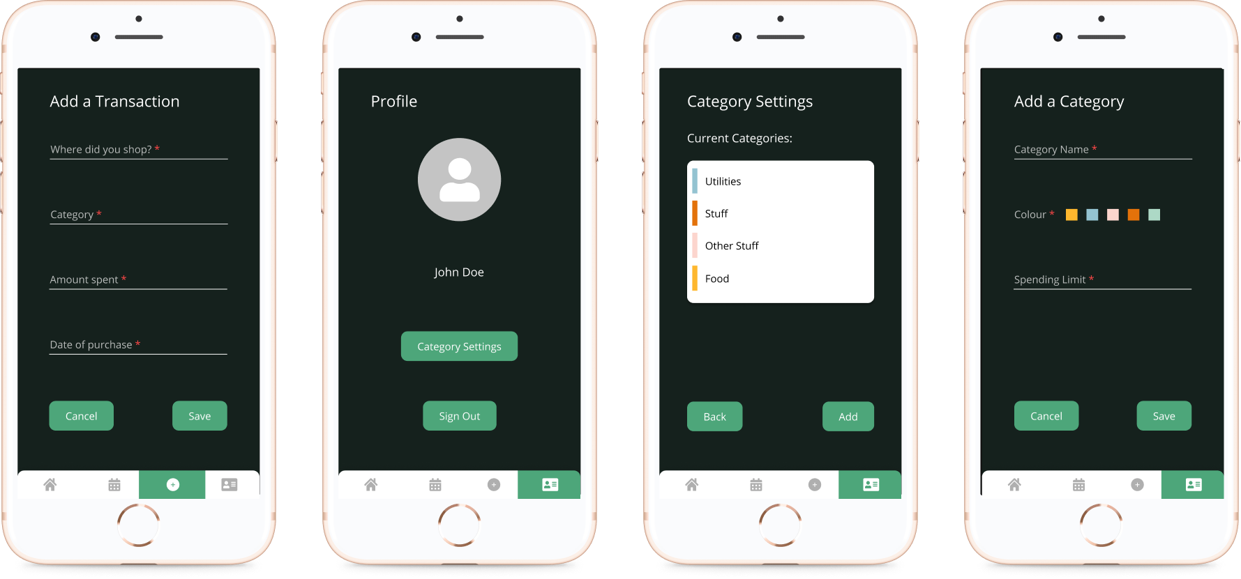
Here is our first attempt at designing this application. We started simple and mapped out a straightforward user journey with the wireframes for simple day-to-day recordings of transactions. Then, we included graphs and tracking bars to show progress. The goal of this application is to indicate to a user their spending trends and allow them to adjust their budget for certain categories based on their financial goals. We wanted to target the core of financial planning, which is planning for a sustainable future and showing a user what they need to buy vs. what they want to buy. We took inspiration from other applications in the industry as well, such as what makes Mint an effective budgeting tool.
Feedback and Iteration
To understand whether our user journey made sense, we asked a couple of students to test out the wireframes we made. The biggest pieces of feedback we received was that certain CTAs were unclear. For example, we had included 2 buttons that allowed a user to “Add a Transaction” - this was confusing to the users. We built upon this feedback to create more intuitive designs afterwards.
Why are there 2 buttons for “Add a Transaction”? It’s confusing.
High Fidelity Solution
Knowing our primary user consisted of individuals in their mid-20s who might be fresh out of school, we designed the UI to be consistent to the types of mobile interfaces they are accustomed to. This involved minimalistic styles and straightforward actions. We also used a dark mode theme because research has shown that a dark mode is much easier on the eyes. Since users are on their phones for a large majority of the day, we wanted to help ease the strain on their eyes as they are using our application as well. Here are the final high fidelity designs.

LEARNINGS FROM THIS PROJECT

Reflections
My biggest takeaway from this project would be to always validate assumptions. It’s so easy to proceed with a project because you feel that you know the people you are designing for but that isn’t always the case. We often have our own biases and because we came up with the initial idea, we are blind to the indicators that we may be pursuing the wrong problem. That’s where the value of talking to the users really comes in.
Next Steps
The next step is to develop this application as an iOS application using Xcode and Firebase. We will also explore methods to test the effectiveness of this tool in helping students with their financial planning.